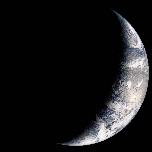
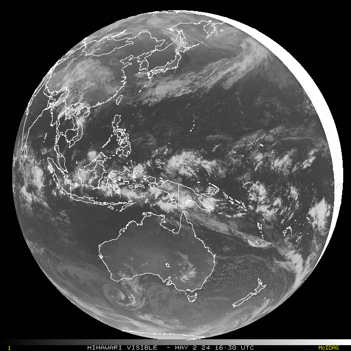
This sequence displays images in the visible spectrum, usually referred to as Enhanced RGB, and the IR 10.8um sensor image each is updated every hour. A Western Europe projection is chosen as this best illustrates how the weather from the North Atlantic develops and affects the European landmass. The visible spectrum only shows details once in daylight so will always appear dark overnight. The IR 10.8um therefore presents a suitable alternative view as it presents the best compromise on displaying cloud formations.


Below is an experimental composite of multiple sensors to produce an image that can indicate the make up the the airmass in the Tropopause. At first it looks daunting to understand, but the provided key a little practice it is possible to build a picture of the height and type of cloud and the veracity of weather systems. The complex image is included here as it may provide evidence to show how large warm airmasses form over the southern North Sea, between the UK, Belgium and the Netherlands causing skewed microwave radio paths.

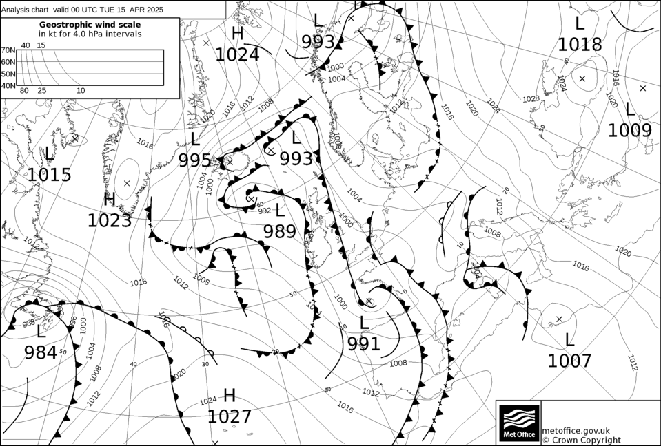
The Pressure Charts and Surface Temperature are generated every six hours by DWD [Many thanks to DWD (https://www.dwd.de)]. A slightly different projection is used in the DWD charts as it concentrates on the North Atlantic Ocean and full European continent weather station reports. This is of great benefit to vhf/microwave radio amateurs over the standard chart from UK MetOffice. As the pressure chart is from Deutscher Wetterdienst Low pressure is labelled T (Tief) and High (Hoch). Both charts are extremely useful in identifying developing systems and their tracks. The standard Bracknell Fax chart is included here.
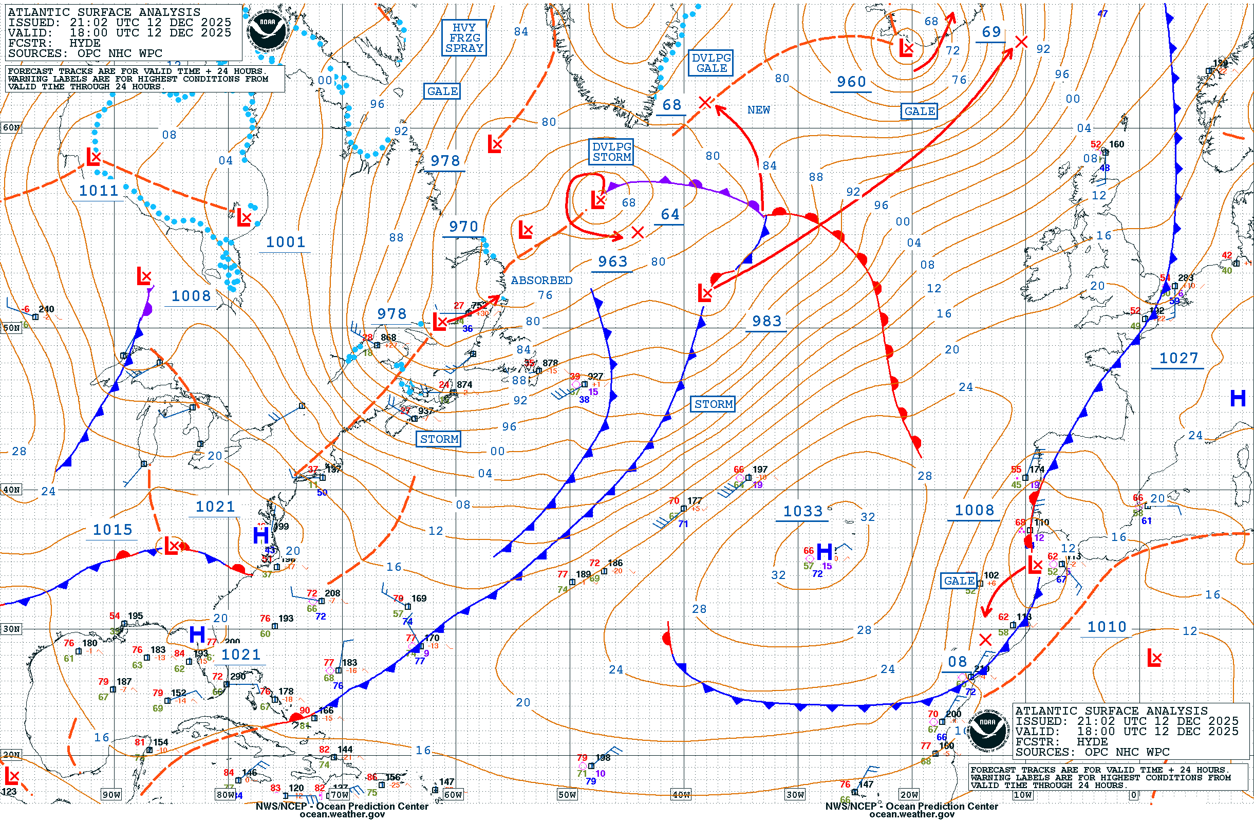
Back by popular demand is the NOAA Surface Pressure Chart. It uses a slightly different mathematical model from the European one so that it generates some differences between the charts. Nonetheless it is extremely useful as an indicator for Atlantic storm tracks.

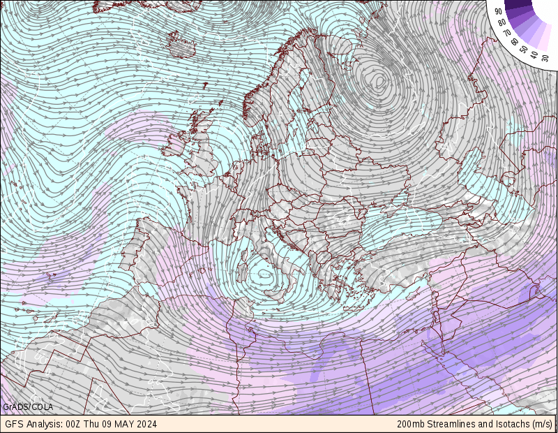
The Surface Temperature Chart is a rolling forecast which is revised every six hours where across Europe it is based on a 6km grid, elsewhere it is 12km.
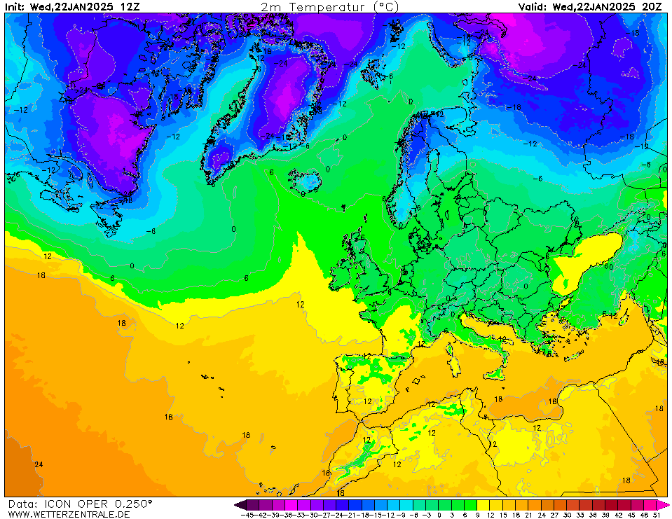
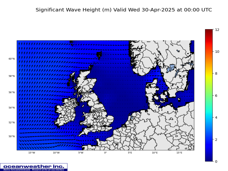
These next images concentrate on sea surface temperature and sea states in the North Atlantic and North Sea. The first shows the water temperature and is useful to assess the extent of sea surface ducting when used in association with the air Temperature and pressure charts above. The wave height chart is generated at 12-hour intervals and published around 06.00utc/18.00utc. Wave height variation introduce amplitude and phase disturbances that cause strong sea surface ducting effects (signal spreading, scattering and strength). At 3cm surface ducts break up when the wave height is more than about 1.5m.

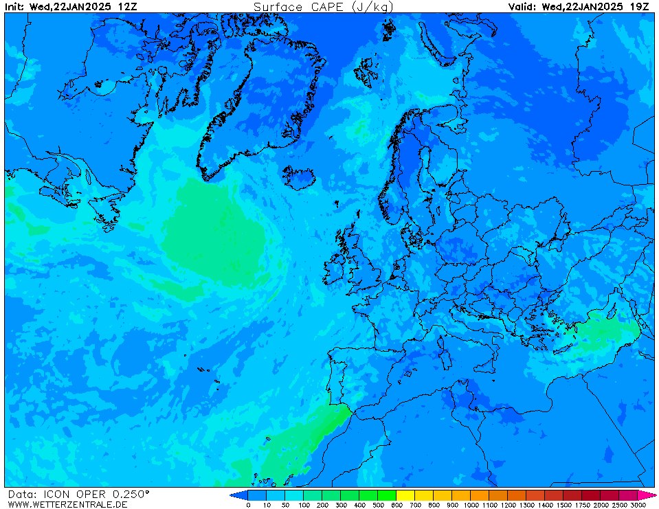
The CAPE (Convective Available Potential Energy) chart is included as it provides an indication as to the stability of the atmosphere and can provide an indication of the updraft strength within thunderstorms. For amateur radio operators exploring the VHF/UHF and microwave regions it can provide an indication of path stability. High CAPE values are associated with thunderstorm activity so there is a chance to experiment on microwave paths before a thunderstorm breaks. Following convention blue hues are low levels with orange and red colours representing higher CAPE levels
Below is a hand generated chart by the wonderful ESTOFEX group. Through their efforts we have daily forecasts of storm activity and live updates on extreme weather.
This section will contain latest information on the level of Carbon Dioxide and other greenhouse gases in out Earth's atmosphere. It probably wil not have much relevance to amateur radio, apart from the ability to breath and live in a hospitable environment, but I will include the data anyway. The IPCC's ARC report on Climate Change can be found here (cut and paste the link): https://www.ipcc.ch/report/ar6/wg1/#FullReport
One thing that is clear is it will only be a couple of years before the UK experiences summer time severe storm forces weather between July and September, followed by further extreme winter storms. In the week 20-26th November 2022 I counted 11 (eleven) fierce forming in the North Atlantic (hurricane force winds). In the main they were kept away thanks to a weak Azores and a strong Scandinavian High pressure area.
That 20m tower you wanted to install? Forget it because unprecedented numbers and strength of cyclones will ensure it will spend more time parked or luffed over.
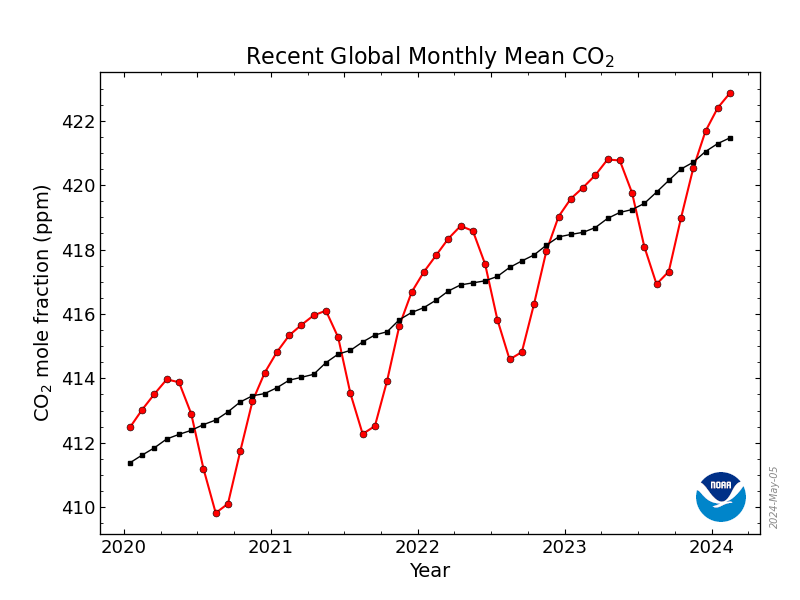
This is the seventh year in succession I have seen a conveyor belt of storms rolling in from the Atlantic across southern UK and into the hot European continent. We saw the result in Germany and Belgium, Hungary, Romania, Spain and Italy in 2021 of horrific floods. In October 2022 Western European mainland continent experienced temperatures of 33°C. The southern UK higher than 20°C - quite alarming. We cannot ignore the wake-up call, in fact we have and it is too late as we are seeing major shifts (probably permanent) in climate. At COP26 David Attenborough gave a speech outlining the need to keep the global Carbon Dioxide Monthly Mean below 414ppm. It is heading to 416ppm in Coctober 2022 ahead of COP27. To paraphrase David Attenborough's address at COP26: Nations have a journey, together with Nature, to create an equitable world. Nature is a keen ally. Nature once determined how we survive. Now, we determine how Nature survives. There is a failure to see the bigger picture in pursuit of short-term goals.
Sadly our governments and politicians are only interested in their self and greed.The red lines and symbols represent the monthly mean values, centered on the middle of each month. The black lines and symbols represent the same, after correction for the average seasonal cycle. The latter is determined as a moving average of SEVEN adjacent seasonal cycles centered on the month to be corrected, except for the first and last THREE and one-half years of the record, where the seasonal cycle has been averaged over the first and last SEVEN years, respectively.

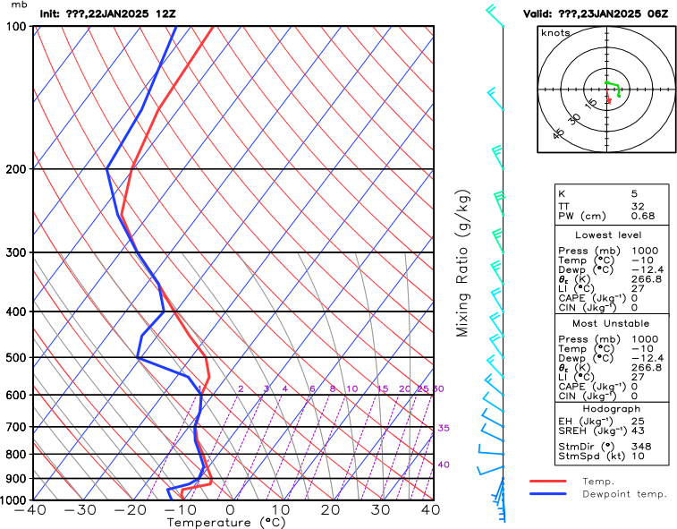
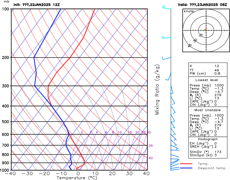
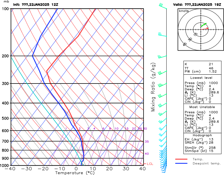
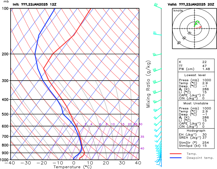
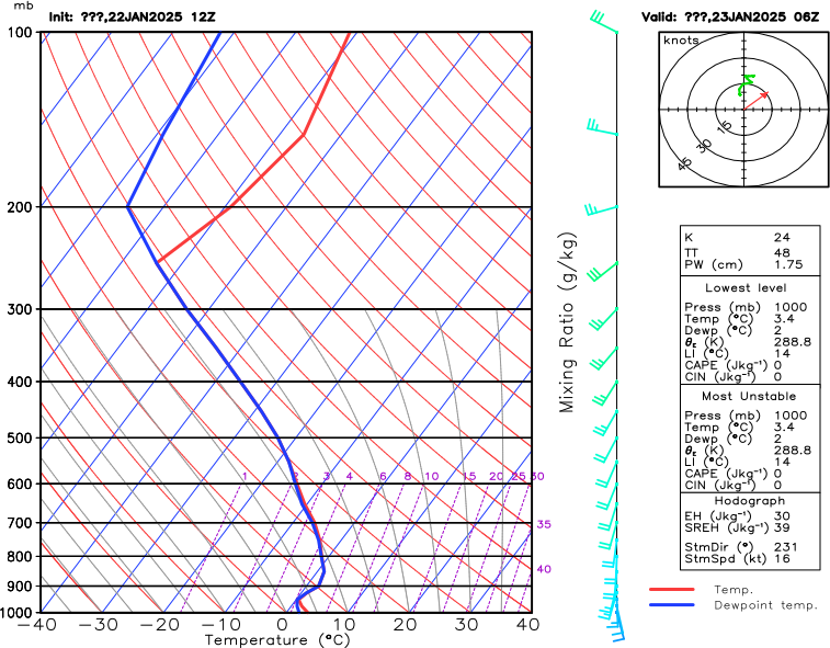
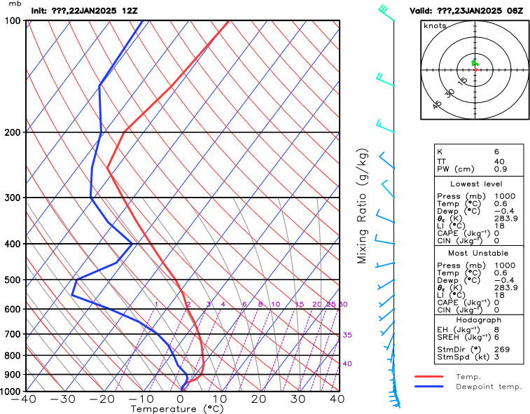
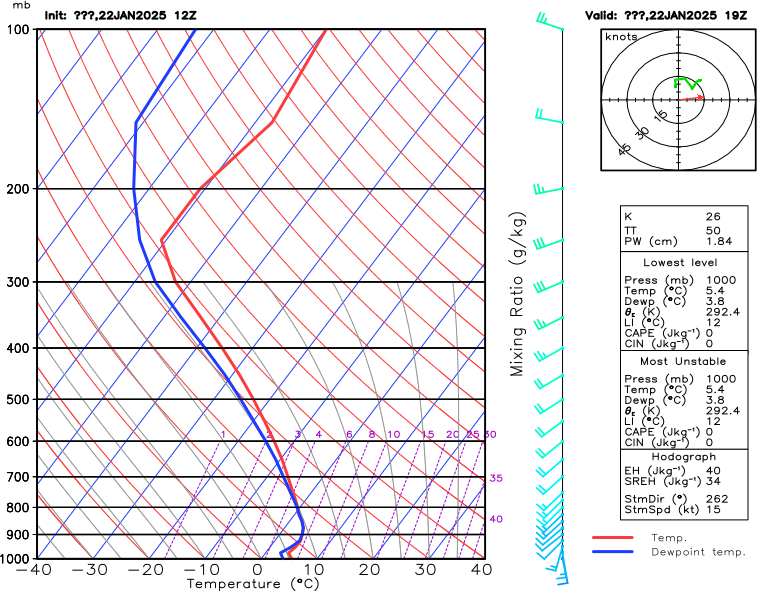
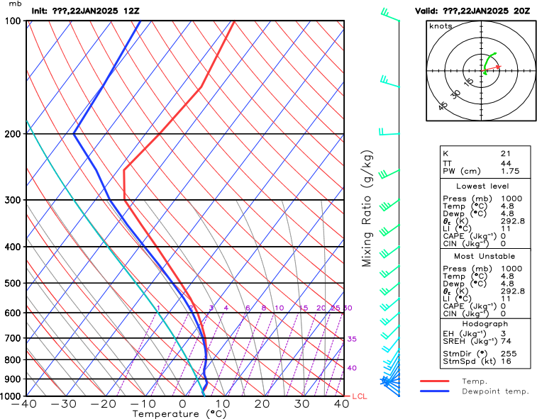
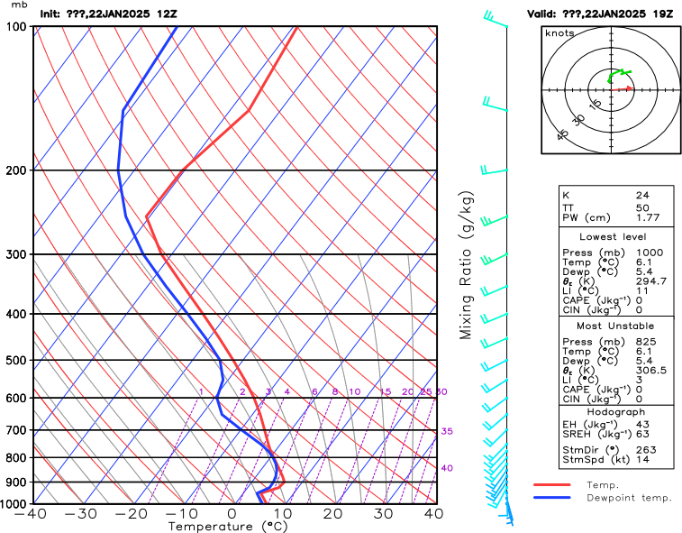
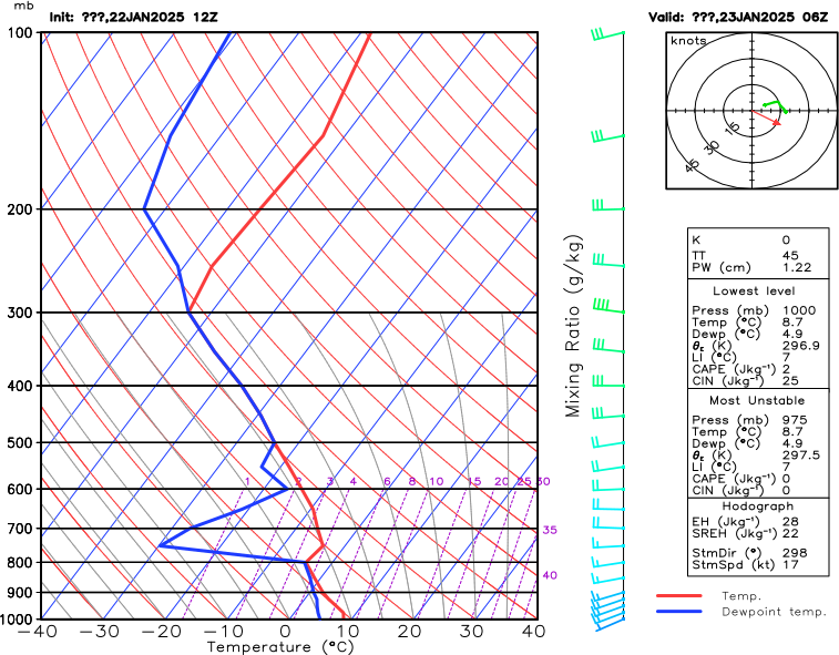
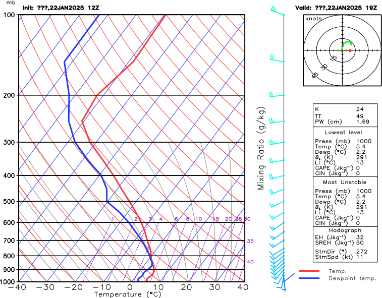
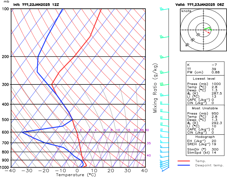
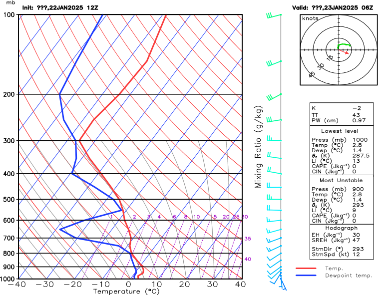
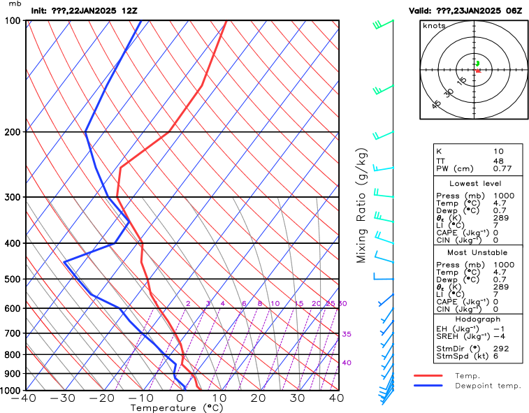
Skew-T charts are indispensible tools to assess the lower and upper atmosphere activity. At first look they are quite complex. For the radio amateur an understanding of the relationships between the red (air temperature) and blue (dew point temperature) lines on the chart brings a great insight into the formation of surface ducts, elevated ducts, ice formation, and elevated scatter regions (common volume).
These charts can be used for predicting tropospheric propagation from about 2.3GHz and upwards. Interpreting them in three ways can bring deep insight into how weather affects microwave propagation.
1) A simple indicator of tropospheric ducting can be found by looking at the behaviour of the RED temperature line. Ay 1000mb or so this effectively indicates surface temperature under normal conditions temperature should decrease steadily, monotonically, as the pressure drops to say 800mb. Often times, especially the London chart, shows temperature increasing with a peak at at around 950mb. This is indicative of a surface duct (temperature inversion - smog layer if London or a big city) forming and may suggest lower loss microwave paths. Sometimes elevated ducts can also form where the temeperature increases significantly around the 550 - 650mb level.2) It is possible to understand where the cloud layers are simply by looking at the relationship between the Dew Point Temperature (Blue line) and the Air Temperature (Red Line). Where these join are very close then that is a good indicator of cloud. It is possible therefore to understand where the cloudbase is and then correlate activities for precipitation scatter.
3) I also noticed that it is possible to predict improved tropspheric scatter conditions using the same technique. Instead of the Blue and Red joining (temperatures equal)they approach each other and then diverge. This can happen at at pressure up to about 200mb and is probably an indicator of the "Common Volume" mentioned above. A study was underway to better understand Common Volume variation when my 3cm equipment failed.
